Dashboards
The SQL Console’s dashboards feature allows you to collect and share visualizations from saved queries. Get started by saving and visualizing queries, adding query visualizations to a dashboard, and making the dashboard interactive using query parameters.
Core Concepts
Query Sharing
In order to share your dashboard with colleagues, please be sure to share the underlying saved query. To view a visualization, users must have, at a minimum, read-only access to the underlying saved query.
Interactivity
Use query parameters to make your dashboard interactive. For instance, you can add a query parameter to a WHERE clause to function as a filter.
You can toggle the query parameter input via the Global filters side pane by selecting a “filter” type in the visualization settings. You can also toggle the query parameter input by linking to another object (like a table) on the dashboard. Please see the “configure a filter” section of the quick start guide below.
Quick Start
Let’s create a dashboard to monitor our ClickHouse service using the query_log system table.
Quick Start
Create a saved query
If you already have saved queries to visualize, you can skip this step.
Open a new query tab. Let’s write a query to count query volume by day on a service using ClickHouse system tables:
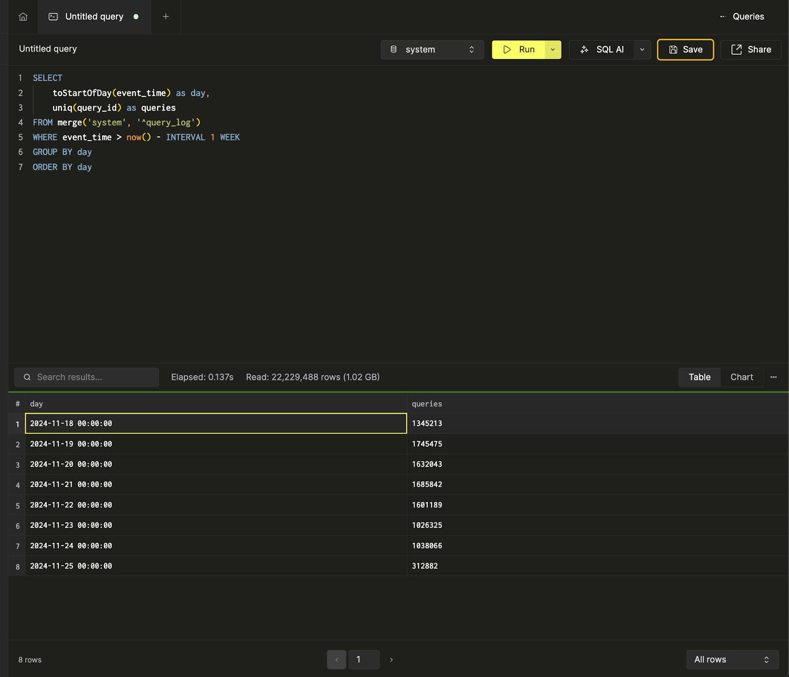
We can view the results of the query in table format or start building visualizations from the chart view. For the next step, we'll go ahead and save the query as queries over time:
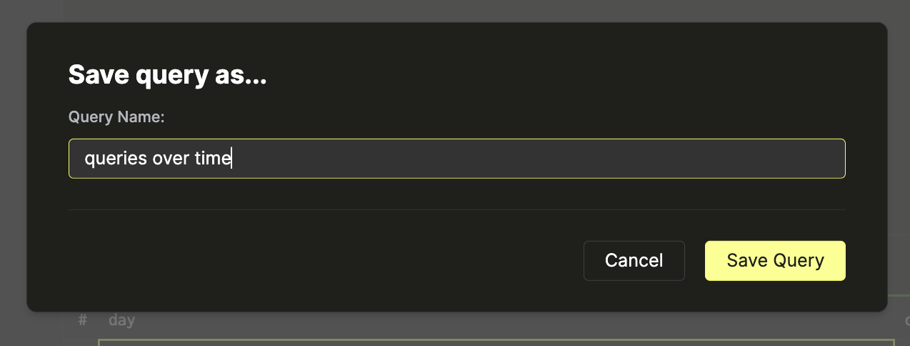
More documentation around saved queries can be found in the Saving a Query section.
We can create and save another query, query count by query kind, to count the number of queries by query kind. Here’s a bar chart visualization of the data in the SQL console.
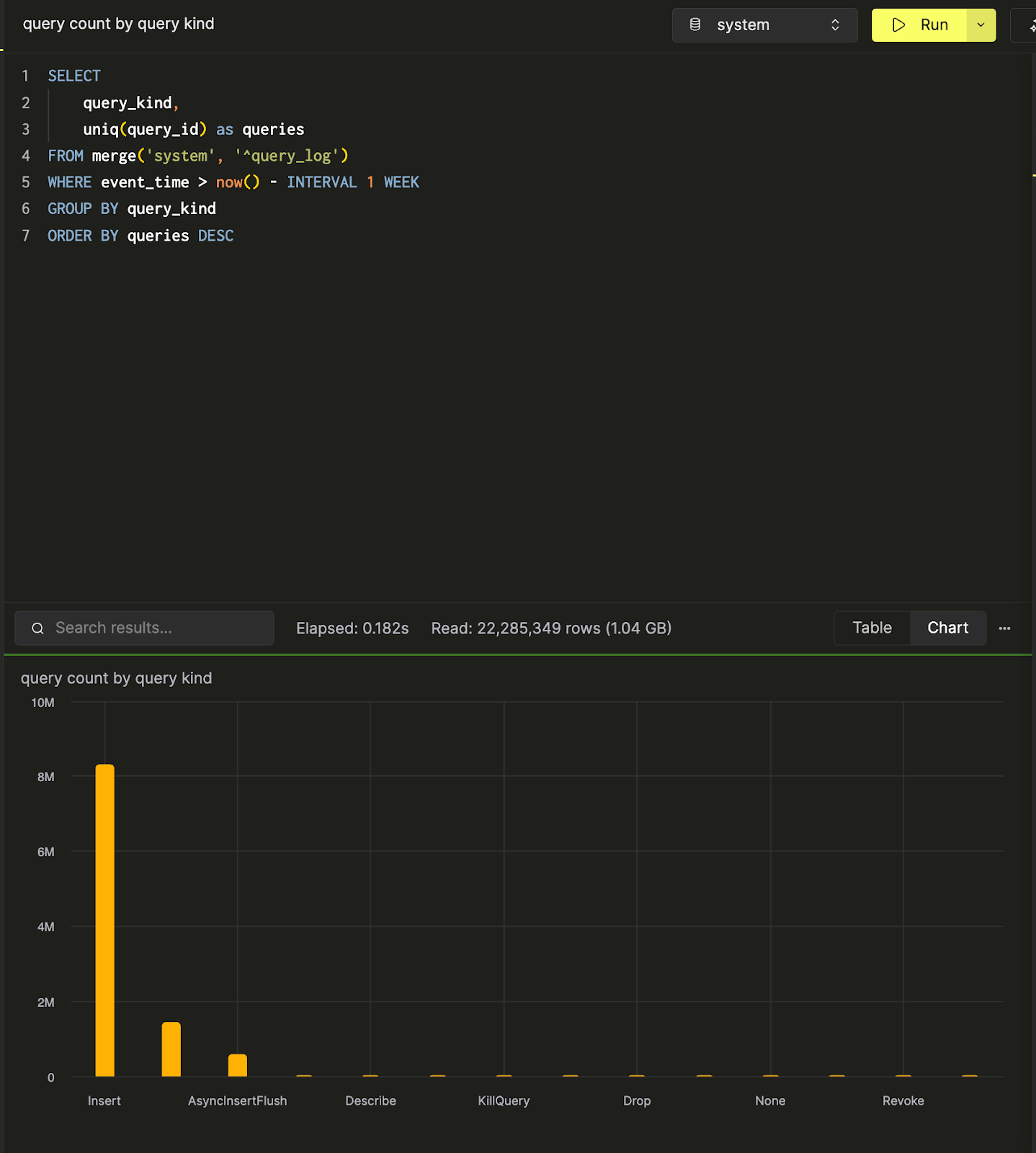
Now that there’s two queries, let’s create a dashboard to visualize and collect these queries.
Create a dashboard
Navigate to the Dashboards panel, and hit “New Dashboard”. After you assign a name, you’ll have successfully created your first dashboard!
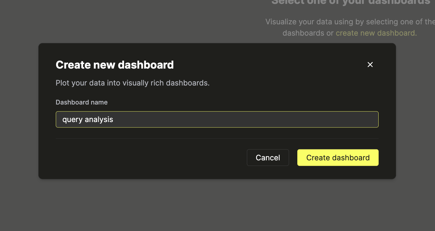
Add a visualization
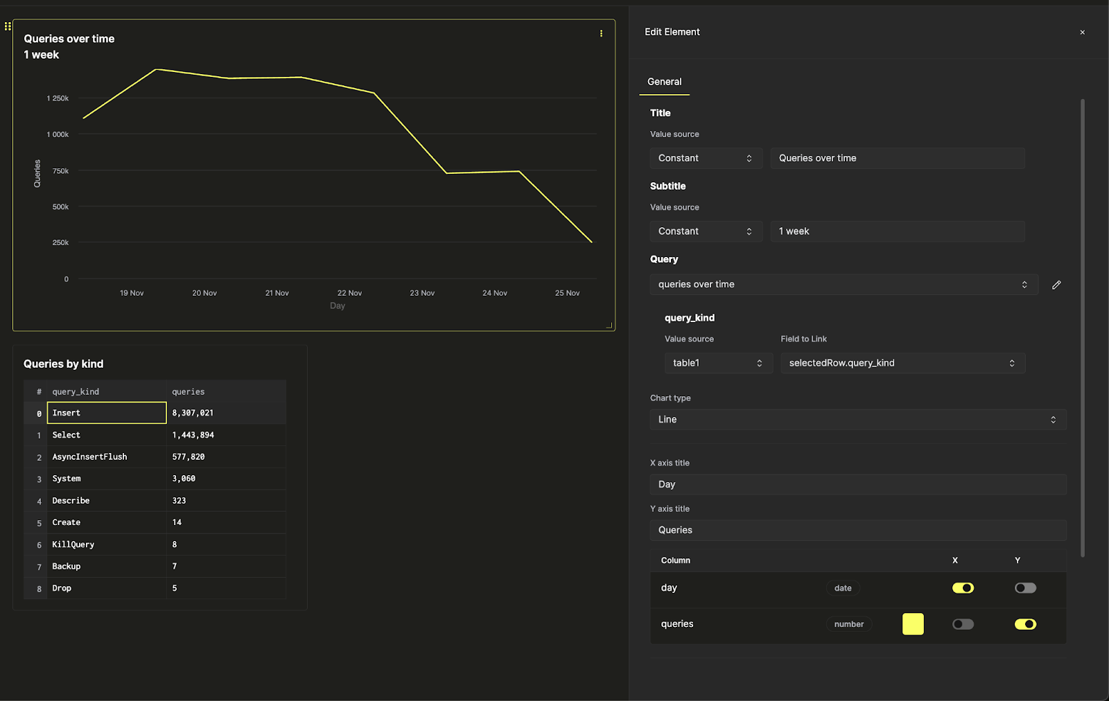
There’s two saved queries, queries over time and query count by query kind. Let’s visualize the first as a line chart. Give your visualization a title and subtitle, and select the query to visualize. Next, select the “Line” chart type, and assign an x and y axis.

Here, additional stylistic changes can also be made - like number formatting, legend layout, and axis labels.
Next, let's visualize the second query as a table, and position it below the line chart.
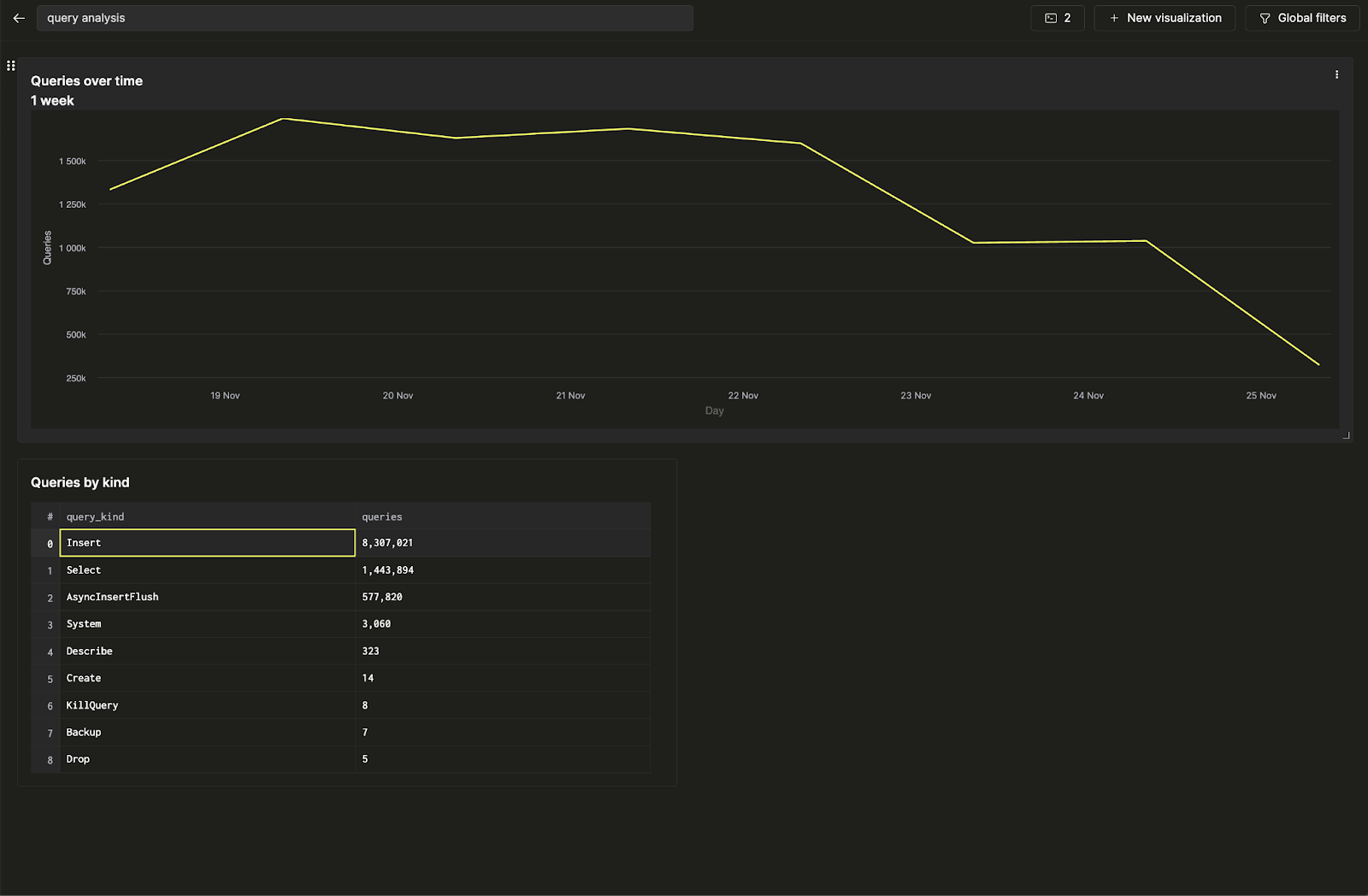
You’ve created your first dashboard by visualizing two saved queries!
Configure a filter
Let’s make this dashboard interactive by adding a filter on query kind so you can display just the trends related to Insert queries. We’ll accomplish this task using query parameters.
Click on the three dots next to the line chart, and click on the pencil button next to the query to open the in-line query editor. Here, we can edit the underlying saved query directly from the dashboard.
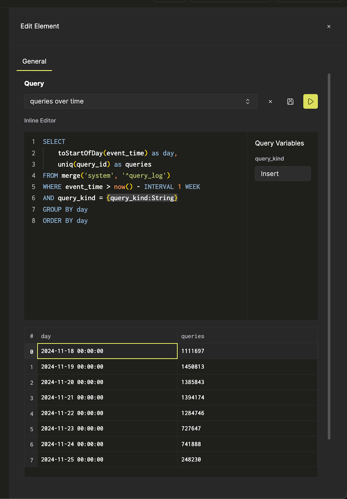
Now, when the yellow run query button is pressed, you’ll see the same query from earlier filtered on just insert queries. Click on the save button to update the query. When you return to the chart settings, you’ll be able to filter the line chart.
Now, using Global Filters on the top ribbon, you can toggle the filter by changing the input.
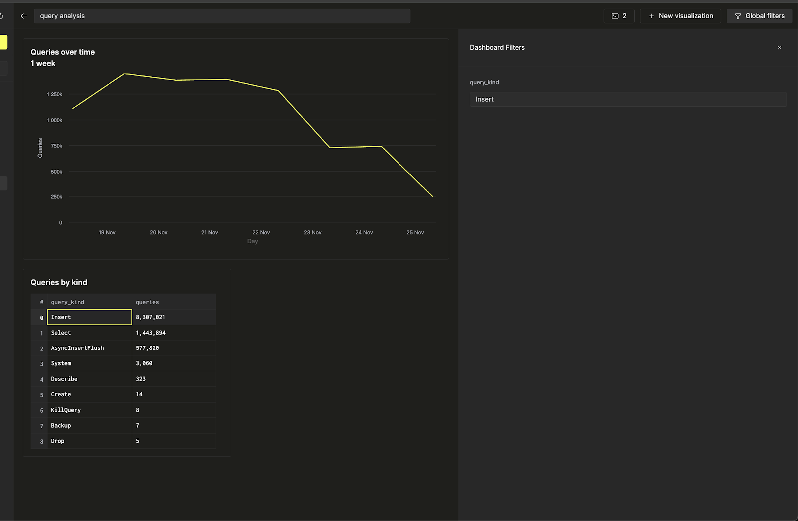
Suppose you want to link the line chart’s filter to the table. You can do this by going back to the visualization settings, and changing the query_kind query parameter’ value source to a table, and selecting the query_kind column as the field to link.

Now, you can control the filter on the line chart directly from the queries by kind table to make your dashboard interactive.
